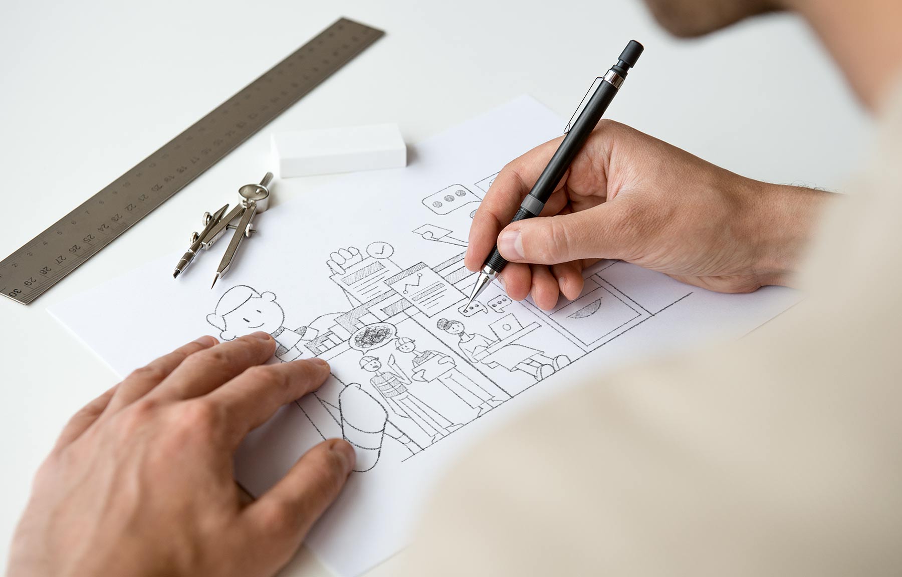
Burling Brown Architects

STUDIO SERVICES
Brand Strategy
Creative Direction / Art Direction
Brand Identity Design
Website Design & Development
Book Design
Client
Burling Brown Architects
COLLABORATORS
Tobias Black
Tim Black
Ciaran Williamson
Live website
Visit website

Burling Brown is a boutique architectural practice with over 40 years of experience delivering projects across education, corporate and community sectors.

We partnered with the studio at a pivotal point in its evolution, as a new generation of leadership stepped in to guide the future of the business.

Our role was to define the brand strategy, clarify its positioning and develop an identity system that respects the legacy of the practice while introducing a more focused and contemporary expression.

Burling Brown Brand image. Open booklet with a black page showing blue text 'Discover' on a light blue background.
BRAND BOOK (PORDL)
Burling Brown Brand image. Blue mirrored B letters on a dark blue background.
BRAND MARK

The Challenge

Burling Brown had a strong history and reputation, but the brand no longer reflected the direction of the business.

The transition to new leadership introduced a shift in energy and ambition, but this needed to be translated into the brand and also communicated carefully. The brand had to evolve without disconnecting from the trust and credibility built over decades.  

The opportunity was to reposition Burling Brown as a contemporary and thought-leading practice, grounded in experience but forward in its thinking.
WEBSITE DESIGN & DEVELOPMENT

Strategy

The strategy centred on refinement rather than reinvention.
Rather than replacing what existed, we focused on extracting the strongest elements of the original brand and shaping those into a clearer, modern aesthic and direction.

This approach allowed the business to retain its credibility while repositioning itself as a progressive and design-led practice. The brand needed to reflect both heritage and evolution acknolwedging decades of experience while introducing a contemporary voice.
Creating a strategic balance where the past informs the future, rather than holding it back.
Burling Brown Brand. Open brochures and booklets showcasing modern architectural photos and graphic design layouts for Burling Brown projects.
Brand strategy Development
Burling Brown Brand image. Close-up of a blue book cover with the word 'BURLINGBROWN' printed in black letters.
printed Book Design & production
Burling Brown Brand image. Open book showing a photo of a modern building corner with orange and black color, featuring the word 'Form.'
book layout design
Burling Brown Brand image. Text logo displaying the name 'BURLINGBROWN' in blue capital letters on a dark blue background.
logo design
Burling Brown Brand image. Two stacks of modern business cards, one bright blue with white contact details, the other dark blue with vertical 'BURLINGBROWN' text and a small logo.
premium foiled business cards

Ideation

The identity system draws directly from the craft and history of the architectural process.

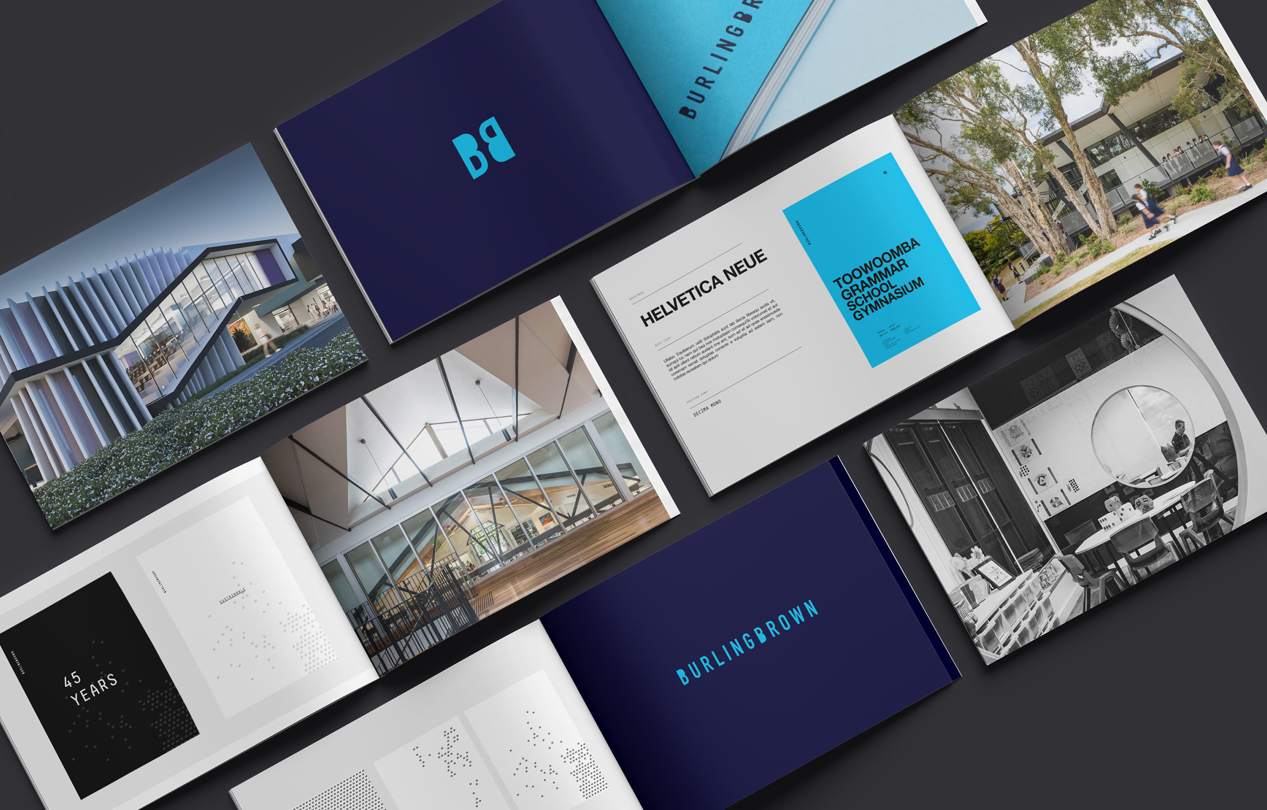
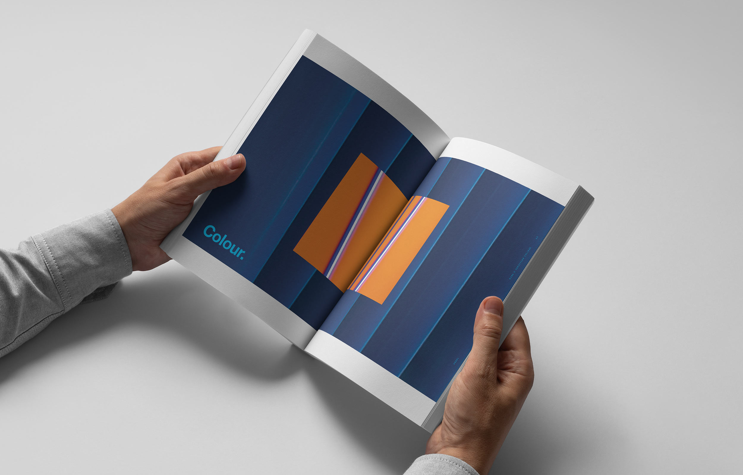
The visual language takes inspiration from traditional manual methods, referencing stamping, drafting and the tactile nature of architectural production. These cues are reinterpreted through a contemporary lens, creating a system that feels both familiar and refined.  

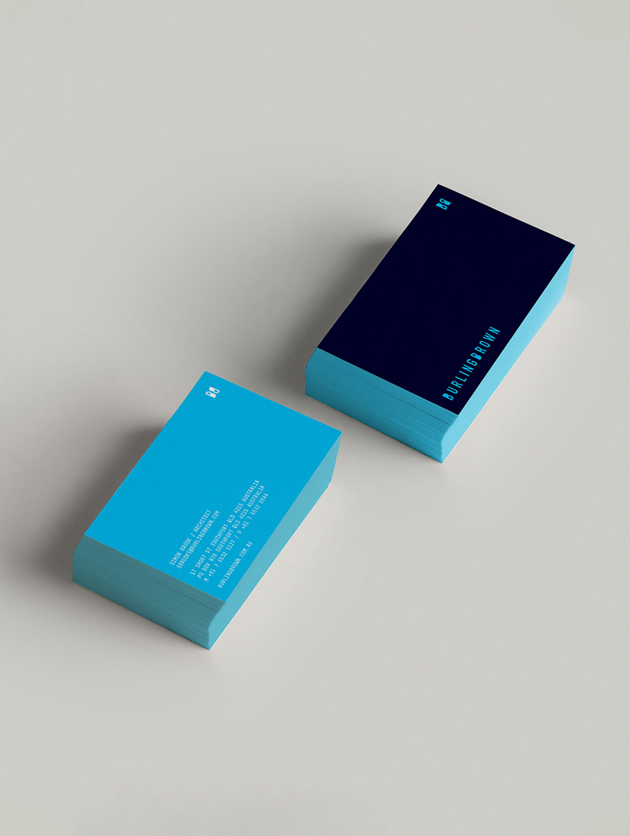
The Burling Brown icon and supporting graphics are built from structured forms that can be repeated, abstracted and scaled. The “BB” pattern evolved from it's original form, into a flexible graphic system, allowing the identity to shift between subtle texture and bold expression depending on the context.  

This introduces a sense of craft and individuality that reflects the studio’s approach to design. It reinforces the idea that each project is considered and tailored, rather than standardised.

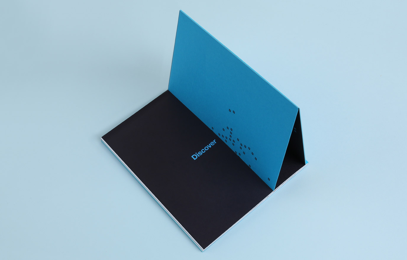
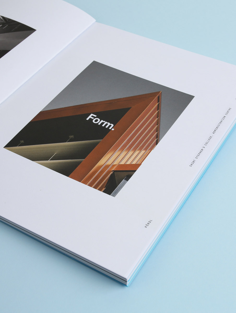
The overall system is minimal when required but also bold and precise, allowing the work itself to remain the hero while the identity provides a consistent and recognisable framework. Together, these elements create a brand that feels contemporary and considered while supporting the transition of Burling Brown into its next phase.
"They helped us articulate who we are and what we do in a way we had never been able to capture before."
Simon Brook
Director / Architect at Burling Brown
Burling Brown Brand image. Two hands holding an open book showing blue pages with orange shapes and the word 'Colour' on the left page.
COFFEE TABLE BooK

The Final Word

Working with Mariachi came at an important time for our practice, as we transitioned to a new generation of leadership. We needed to reposition the business in a way that respected our history, while giving us clarity about where we are heading.

The process was genuinely engaging and also quite enlightening. It was refreshing to step into a different creative discipline and see how Mariachi approached strategy and applied it in their creative brand outcomes.

They helped us articulate who we are and what we do in a way we had never been able to capture before.

The outcomes gave our entire team a renewed sense of energy, excitement and direction as we began rolling it out. What stood out was their ability to respect and build on the legacy of Burling Brown, rather than trying to reinvent it.

They took what already existed and reshaped it without losing the essence of the practice.

The “Pordl” coffee table book was a really strong example of this thinking in action. It became a tangible way we are able to present both our heritage and our future direction side by side, and was a fantastic gift that truly resonated with both existing and prospective clients.

Simon Brook – Director / Architect at Burling Brown
Other Stories