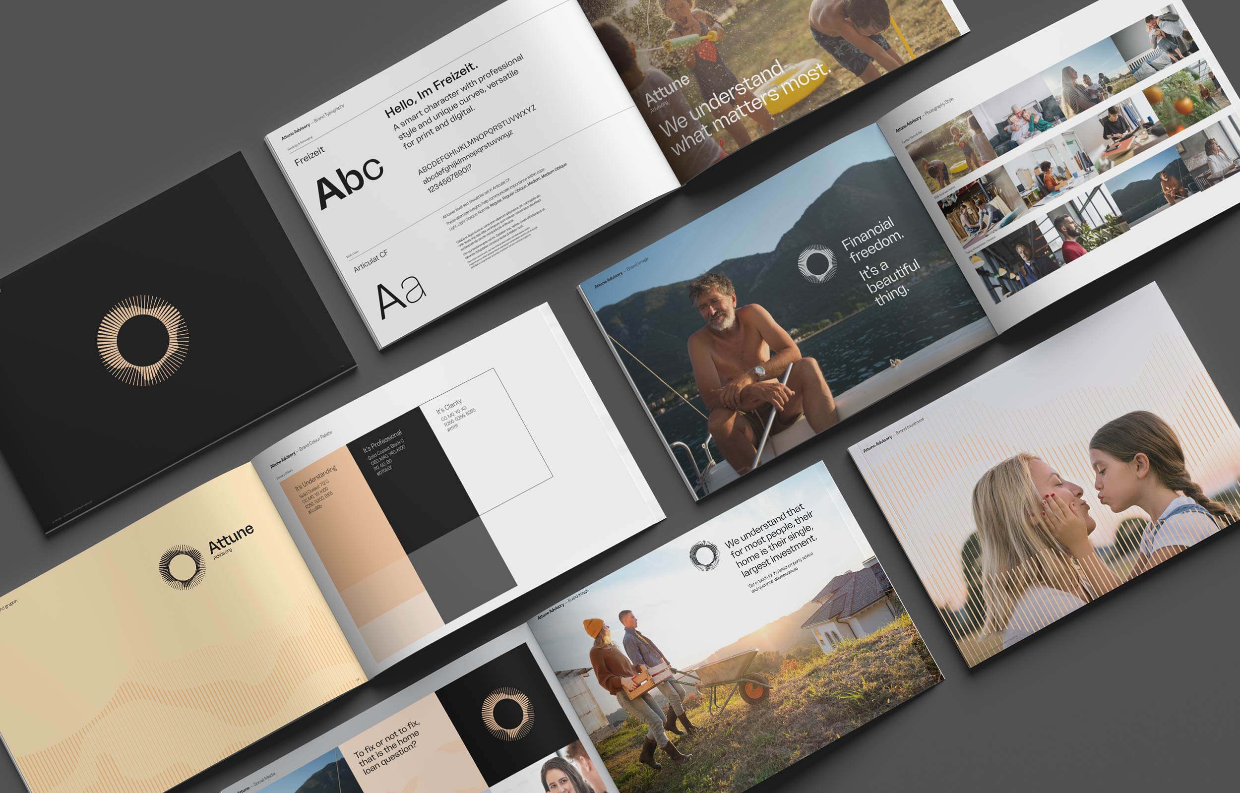
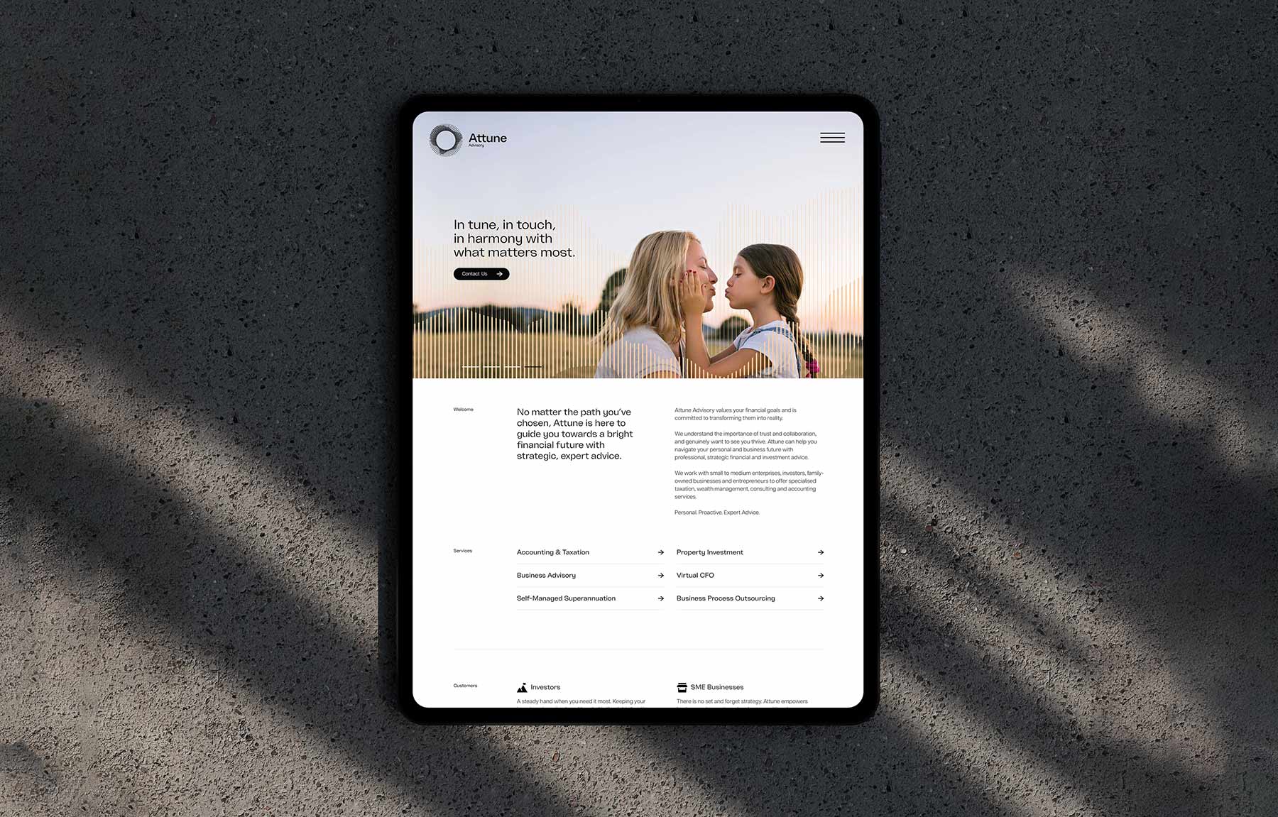
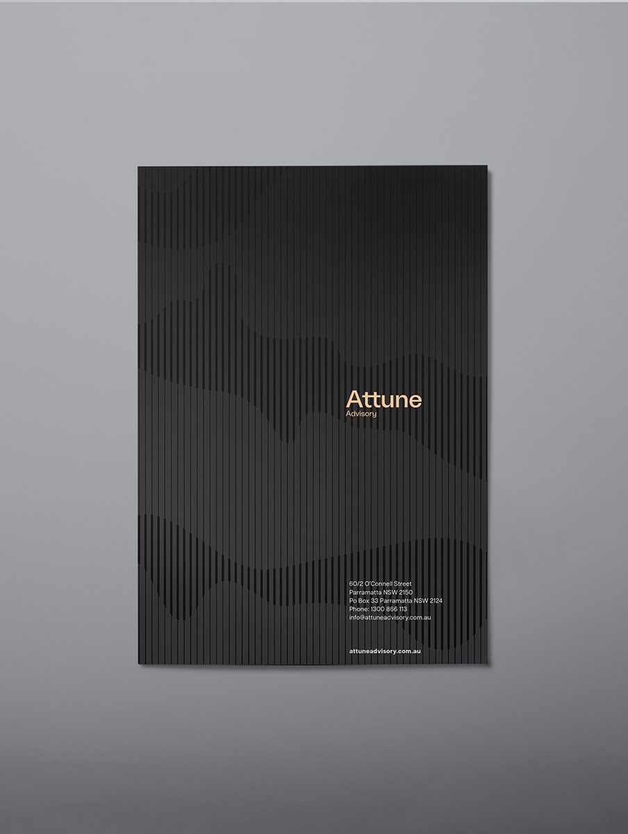
Attune Advisory

STUDIO SERVICES
Brand Strategy
Creative Direction / Art Direction
Brand Identity Design
Client
Attune Advisory
COLLABORATORS
Tobias Black
Ciaran Williamson
Live website
Visit website

Attune Advisory is a Sydney Accounting firm focused on guiding individuals, families and businesses towards long-term financial freedom.

We partnered with the team to define their brand strategy, reposition their market presence and develop a distinctive identity system, supported by website, marketing and ongoing brand rollout. The result is a brand that feels clear, intelligent and human, helping Attune stand apart in a category often defined by complexity, jargon and generic, even boring corporate aesthetics.

Attune headline
POSITIONING / BRAND IDENTITY
BRAND MARK

The Challenge

The accounting and advisory sector is saturated with firms that rely on technical language, clichés and conservative visual identities.  

For clients, financial decisions often happen at pivotal moments in life. These are usually emotional, high-pressure situations where clarity and trust are critical.  

The challenge was to create a brand that cuts through this noise, simplifying complex situations while positioning Attune as a calm, intelligent and proactive accounting partner and trusted advisor.

The opportunity was to shift perception from reactive accounting services to strategic guidance that is always active and aligned with client goals.
WEBSITE DESIGN & DEVELOPMENT

Strategy

The brand was built around a simple but powerful idea:
In touch. In tune. In harmony.  

This positioning reflects Attune’s role as an active advisor, continuously monitoring, adapting and guiding clients through changing business and personal financial scenarios.

Rather than presenting advice as static or transactional, the strategy reframes the advisory services as an ongoing, responsive offering built on insight, clarity and trust. The tone of voice reinforces this thinking. It is direct, calm and knowledgeable, removing unnecessary complexity while maintaining professional authority.  
A brand platform that speaks to real people at meaningful moments, delivering reassurance and confidence when it matters most.
Attune Advisory Brand image. Open brochures and branding materials showing Attune Advisory's logo, typography, color palette, and lifestyle images focused on financial freedom, home investment, and family.
BRAND STRATEGY DEVELOPMENT
BRAND MESSAGING
Attune Advisory Brand image. Smiling parents carrying their two happy children on shoulders in a mountainous outdoor setting.
BRAND IDENTITY & PHOTOGRAPHY DIRECTION
Attune Advisory Brand image. Tablet displaying Attune Advisory website homepage with a banner image of a woman and young girl touching faces and company services and descriptions below.
UI / UX & WEBSITE DESIGN
Attune Advisory Brand image. Black brochure with vertical stripes and wavy pattern featuring the text 'Attune Advisory' and contact details in white and orange.
BUSINESS COLLATERAL DESIGN

Ideation

The identity system brings this strategy to life through a visual language that expresses active intelligence and continuous movement.

At the centre sits the Attune brandmark, a circular form that represents trust and stability. Within it, active flowing lines move and adapt, symbolising the ongoing monitoring and adjustment of financial strategies in response to changing conditions.  

This idea extends beyond the logo into a visual identity system. Overlaying and interacting with other brand elements, these evolving lines create a sense of rhythm and motion, reinforcing the concept of financial guidance that is always active, always responding and always in tune with the client.  

The visual language balances structure and fluidity. It conveys intelligence and control while introducing a human, approachable quality that is often missing in the category.

Together, these elements position Attune Advisory as a modern, intelligent and highly engaged partner, redefining how financial advice is perceived and experienced from an boutique firm.
"Mariachi are true storytellers, with the ability to shape how people experience your brand."
Cedomir Jesic
Founder & Director - Attune Advisory
Attune Advisory Brand image. Billboard showing a mother and daughter touching faces affectionately with text reading 'In tune, in touch, in harmony with What matters most.'
BILLBOARD ADVERTISING

The Final Word

The Mariachi brand strategy process is genuinely impressive.
They take the time to deeply understand your business which ultimately makes a noticeable difference in the outcome.

Every creative decision is considered and intentional, and they clearly explain the thinking behind it. This made us feel a high level of trust that it was in safe hands throughout the process.

When the strategy was brought to life, the results were exceptional. The level of design thinking and creative execution was a very high standard, and it’s clear that everything had been carefully crafted rather than just designed on its own.

We now work with Mariachi across all of our marketing and communications, from our website and digital marketing through to print and photography direction. Having that consistency has been invaluable in maintaining a strong and professional brand presence.

We would highly recommend Mariachi to any business who wants to look and feel better. They are true storytellers, with the ability to shape how people connect with and experience your brand.

Cedomir Jesic - Founder & Director of Attune Advisory
Other Stories