Ideation
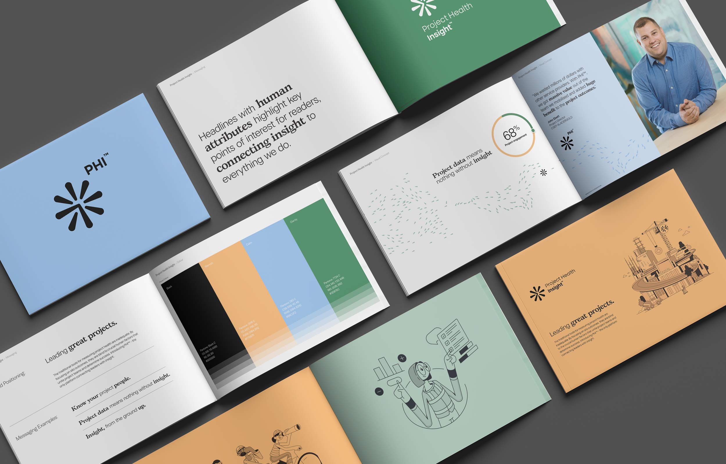
The identity system brings this strategy to life through a distinctive and highly considered visual language.
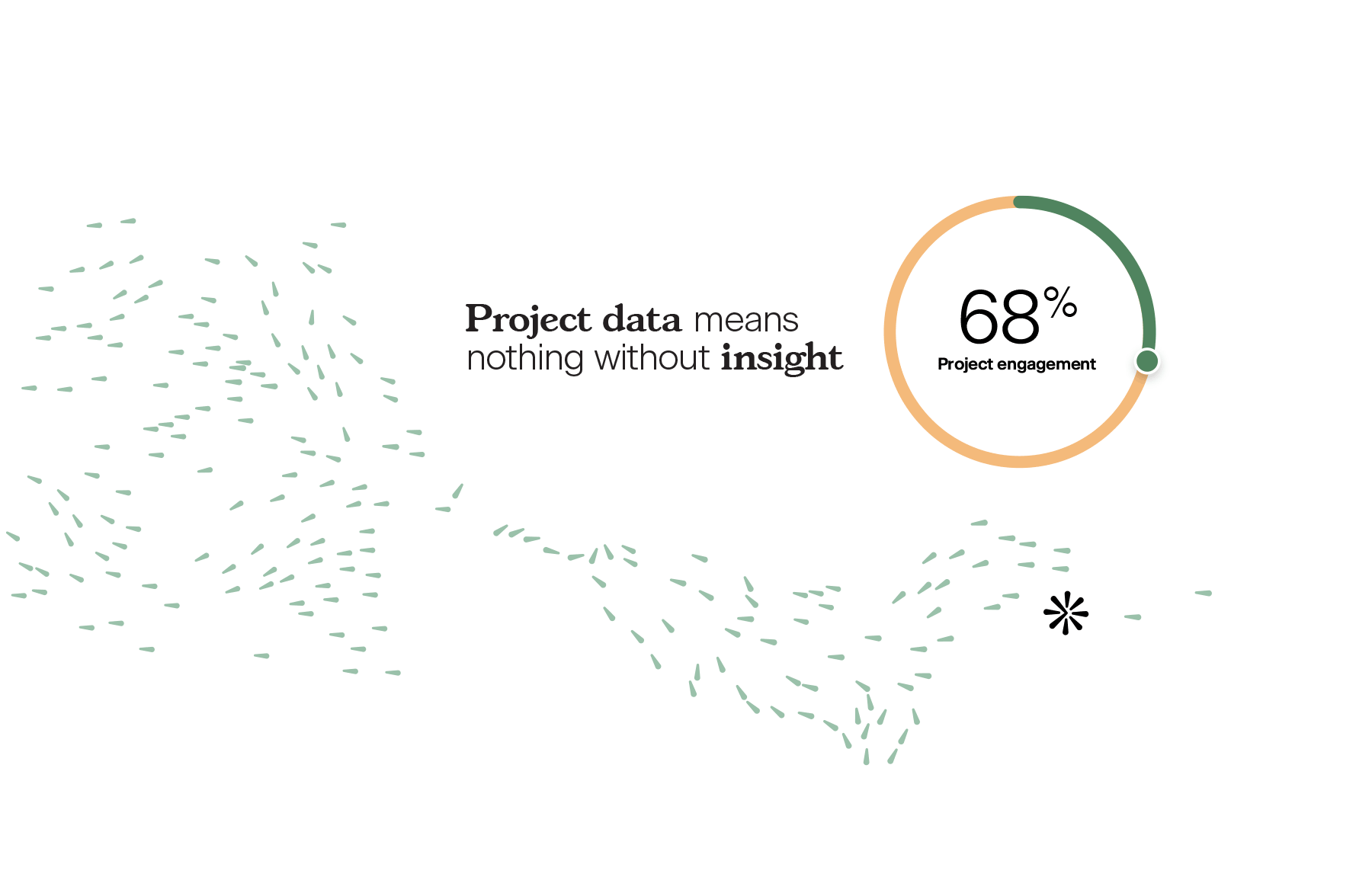
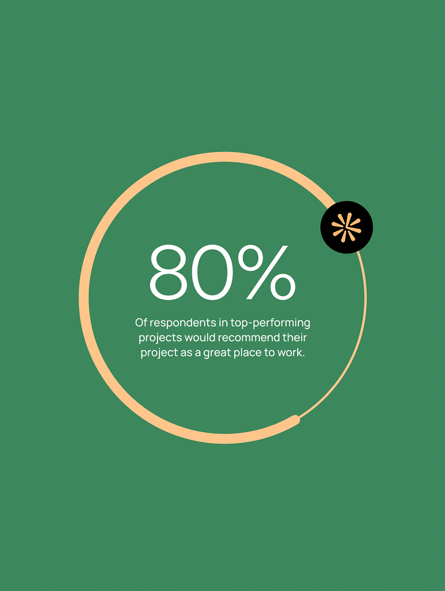
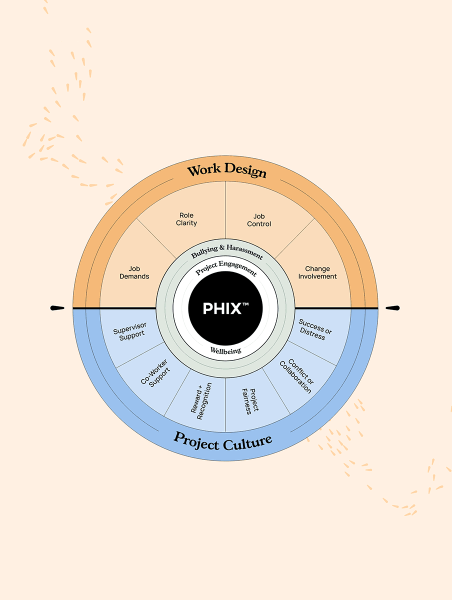
At the centre of the brand is the asterisk symbol, a universally recognised marker used to highlight important information. Within the PHI identity, it becomes a dynamic device that directs attention, connects ideas and reinforces the concept of insight.
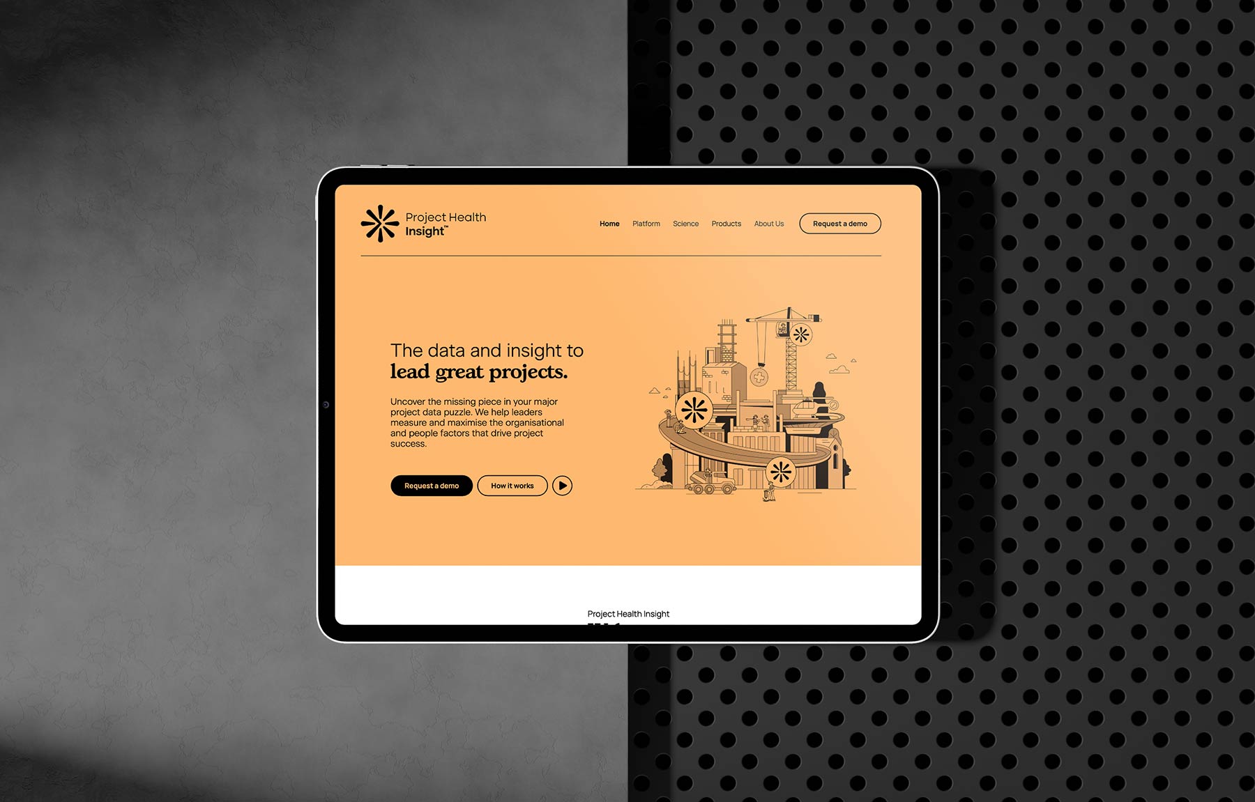
The illustrations are also a defining feature of the brand. Developed as a core communication tool, the illustrations interpret complex project scenarios into relatable, human-centred visual stories, delivered with a fun and grounded personality that reflects their human-centred philosophy.
These illustrations also reinforce the reality that projects are unique, complex and rarely linear. They help to soften the delivery of difficult insights, making it easier for leaders to unify teams and action outcomes to help them reach project milestines.
Colour, typography and layout further support this approach. The palette balances warmth, calm and clarity, while the typography remains clean and highly readable, ensuring information is easy to absorb – even in high-pressure contexts.