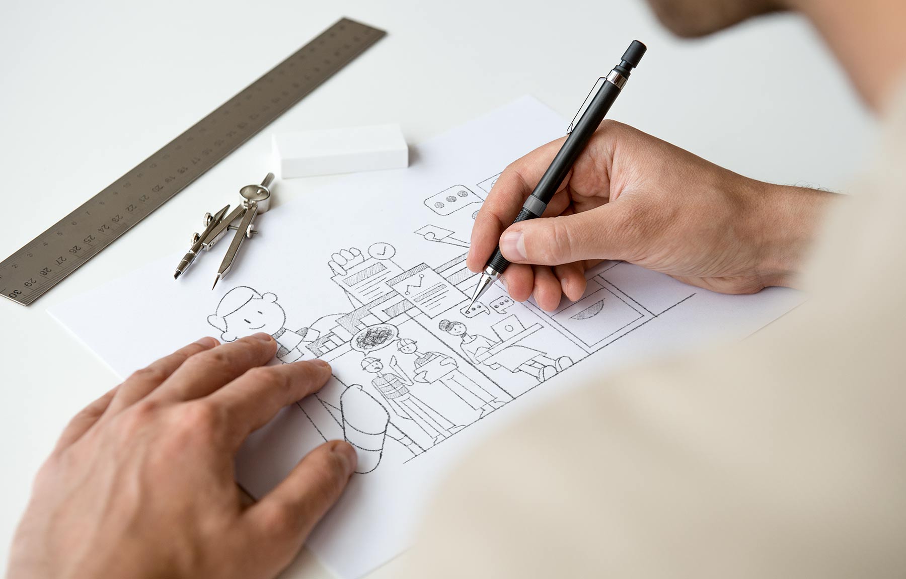
Ideation
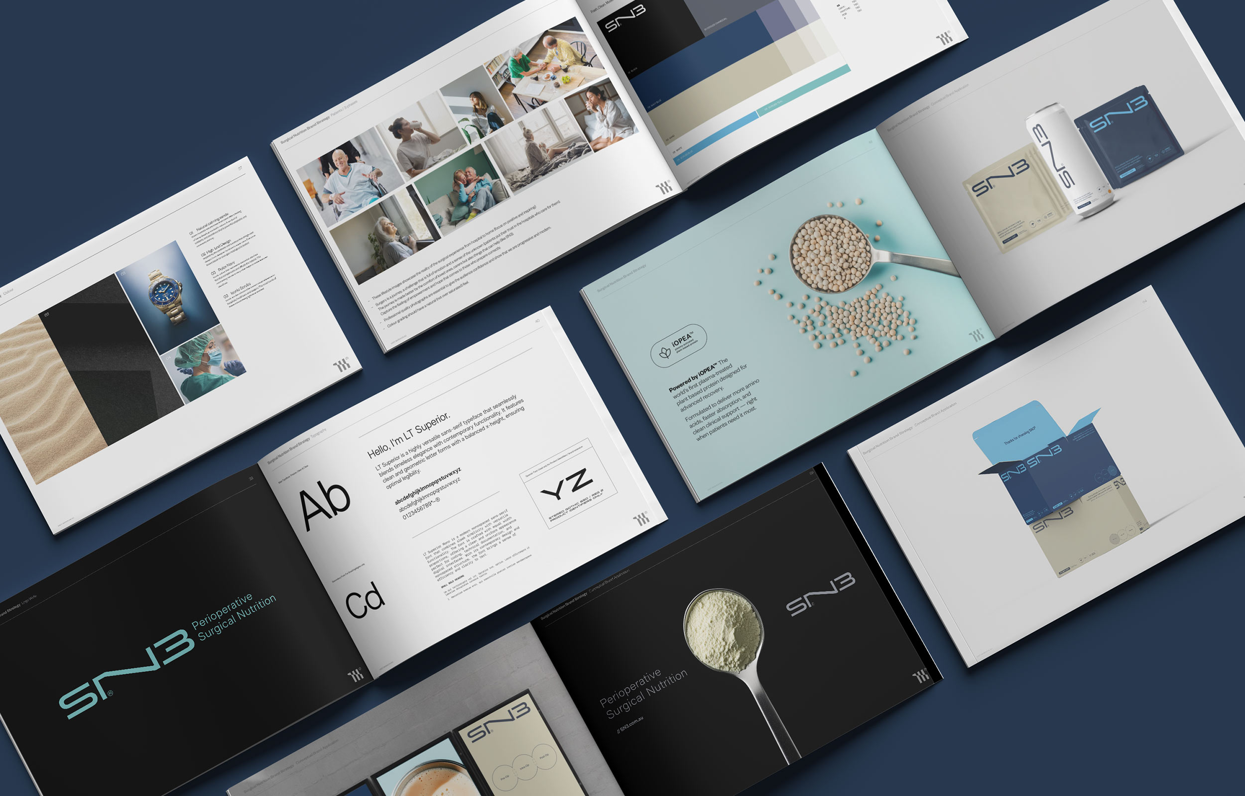
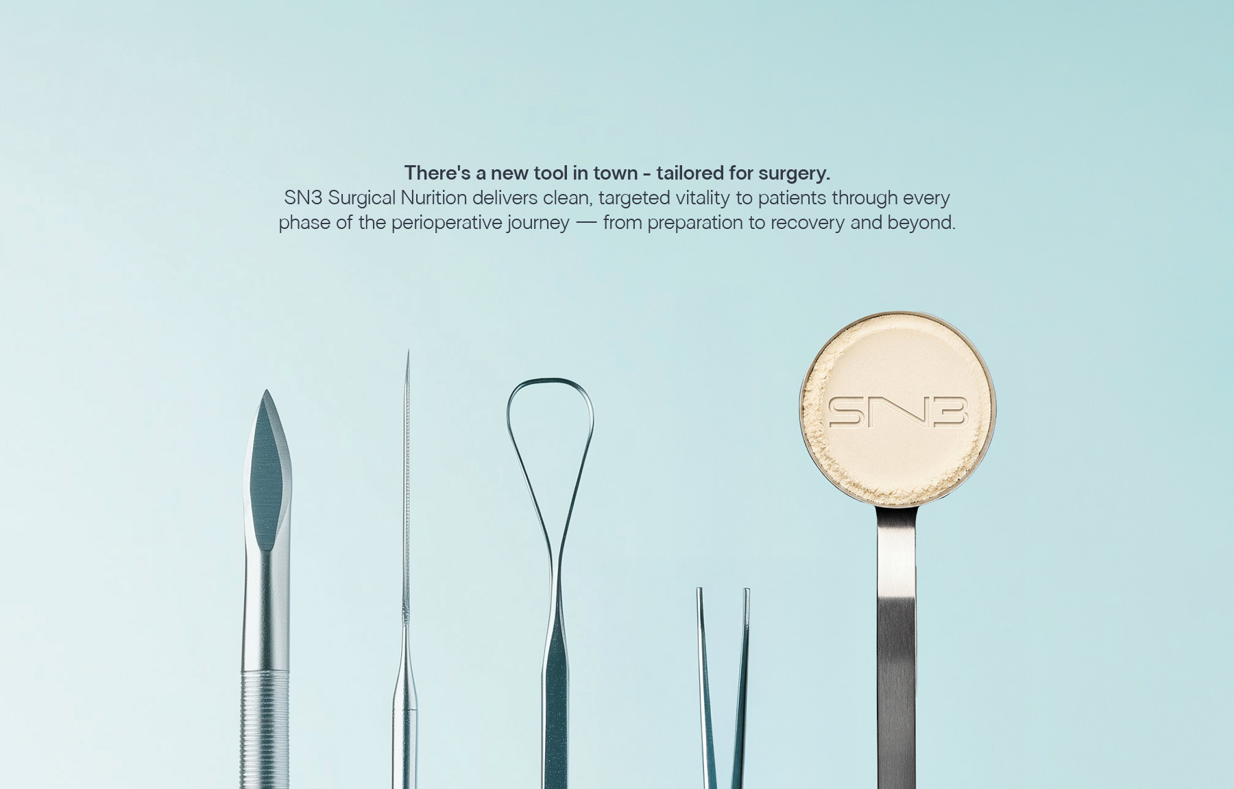
The identity system was designed to break away from traditional medical and supplement aesthetics, introducing a bold and modern visual language that signals confidence and innovation.
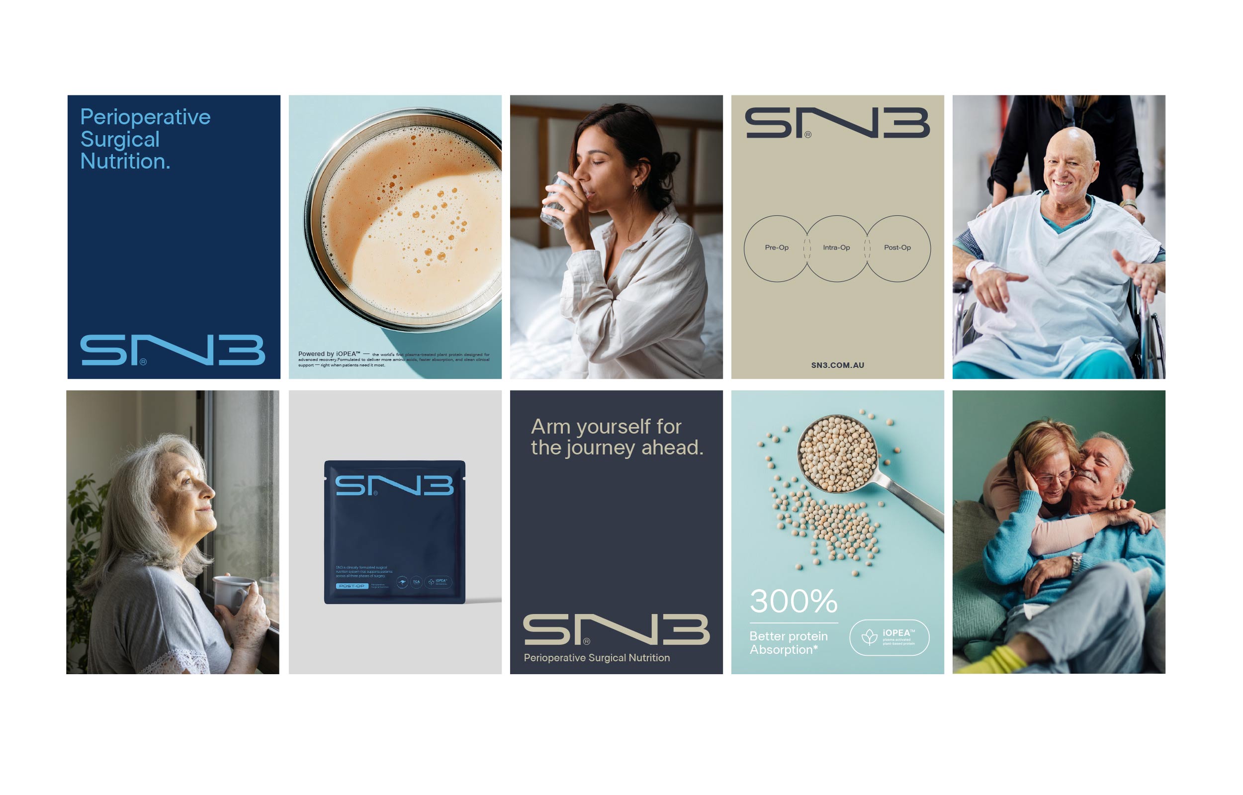
The SN3 name itself reinforces the three-phase system, creating a direct link between brand and product structure.
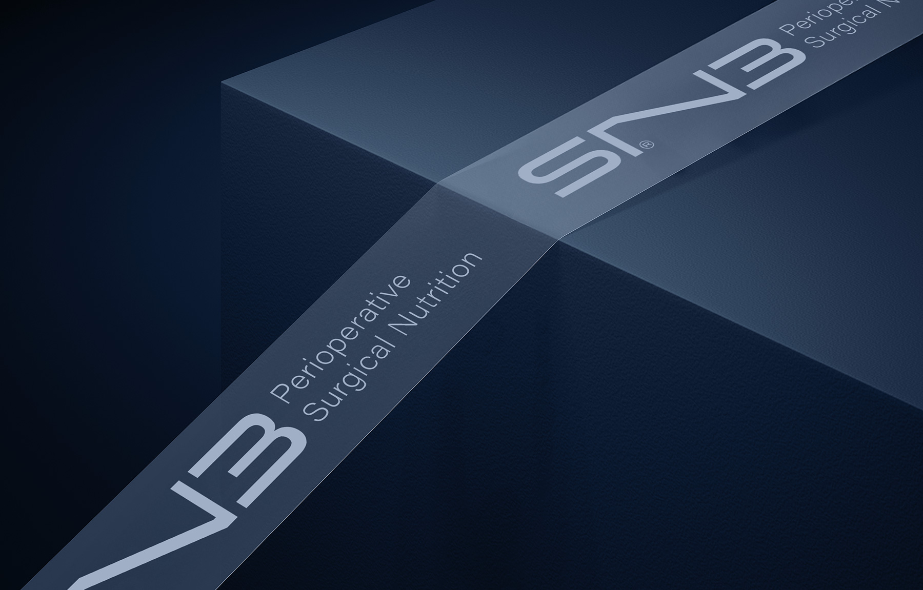
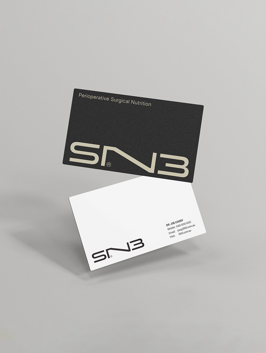
The word mark is clean, minimal and highly visible, designed to stand out in clinical environments while maintaining a refined, design-led presence. It signals a clear departure from both generic hospital nutrition and consumer wellness brands.
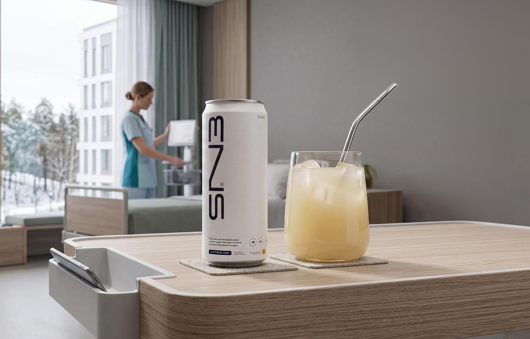
The product and packaging system extends this thinking. Each element is structured, precise and easy to navigate, helping time-poor healthcare professionals quickly understand the offering. Iconography and identifiers reinforce key product benefits and the three-phase system enables fast decision-making at a glance.
The broader visual language draws from surgical cues, natural elements and high-end design references, creating a balance between clinical precision and human experience. This ensures the brand resonates with everyone across hospitals, clinics and patients.
Together, these elements create a brand that is confident, distinctive and highly functional, transforming how medical nutrition is perceived and experienced.